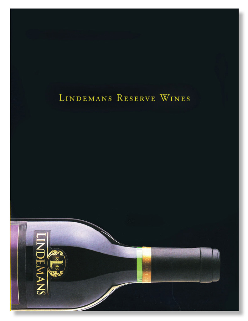
Lindemans
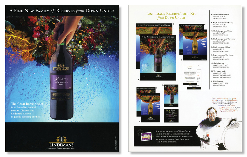
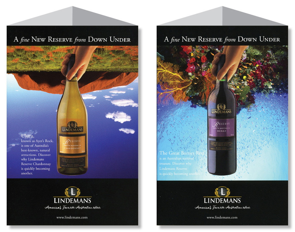
When we were approached by Lindemans to help them launch their Reserve family of wines, we were told that the company’s Australian heritage should be a key component of the messaging and look and feel. At the time, Aussie wine was just breaking in a big way in America and it seemed that wine labels were teeming with kangaroos, boomerangs, and aboriginal art. We decided to turn the problem upside down—literally.
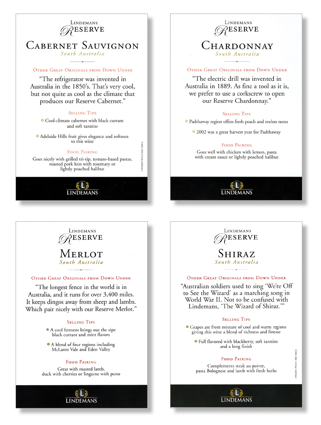
In addition to thinking about the challenge differently in terms of look and feel, we also figured out how to differentiate the selling proposition. In addition to the standard collateral elements of sell sheets, case cards, and table tents, we also came up with unique ways of helping restaurant staff educate their customers on proper wine/food pairings with a Down Under flair.
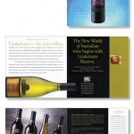
- Lindemans Sales Booklet
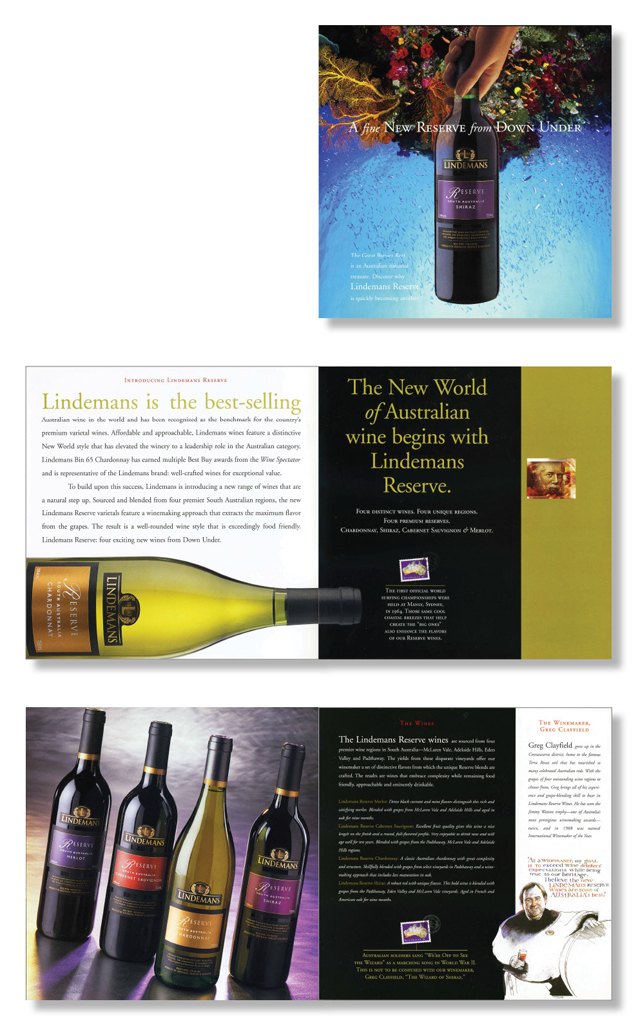
- Lindemans Folder
- Lindemans Sales Sheet
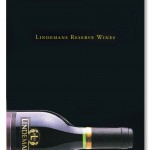
- Lindemans Table Tents
- Lindemans Waiter Cards